Tips

All shapes are possible. Feel free to think outside the traditional shapes!
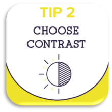
A striking and clear badge, even from a distance? Use sufficient contrast.
A bit like our images in this text.
A luxurious look and feel: a badge that catches the eye: WIN-WIN!
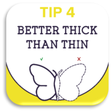
It's simple: Thick lines stand out much better than fine lines...

- Shorten your text as much as possible. Less is definitely more!
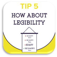
- POWDER LETTERS certainly improve readability.
- The ideal minimum height for lettering is 4 to 5 mm,
- The thickness of the legs should be at least 1 mm.
- Do not stick letters too close together, but give them some space.

Remove all unnecessary elements, shorten your text as much as possible or drop it if you can.
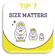
Scissors and paper are the best tools to check whether your design can be smaller or if it needs to be bigger!

Feel free to ask the opinion of a critical test audience.
Or you can of course call in our embroidery specialists to take a critical look at your design.
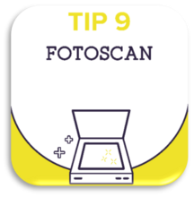
Order a hyper realistic digital proof -a scan- where your design is already embroidered.
You pay 20 euros for a photo scan, but this amount is refunded in full when you place an order.
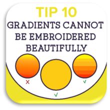
A gradient cannot be embroidered beautifully. For this reason, we recommend that you divide the part in which you want a gradient colour into coloured strips. The best effect, however, is achieved by working with plain surfaces.
 by
by